Making Financial Literacy Fun through Gamification
An interactive learning platform within the Paytm platform that teaches users the fundamentals of trading.

industry
Services Provided
PLATFORMS
BUSINESS TYPE
Overview
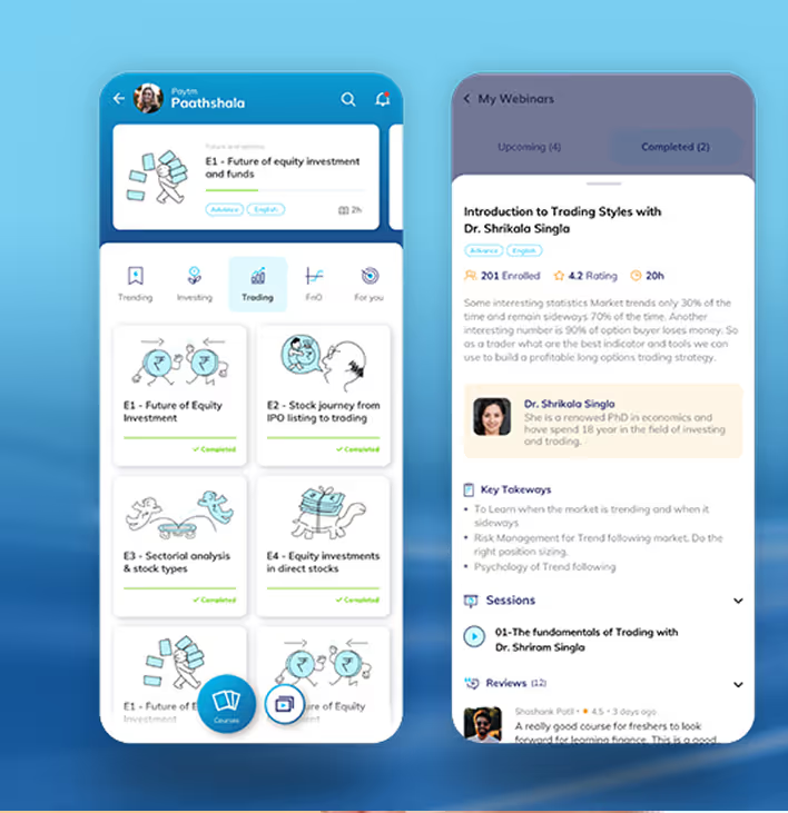
Paytm is a leading Indian digital payments and financial services platform, trusted by over 30 crore users worldwide. Paytm Paathshala is a part of the ecosystem and sets out to teach the basics of trading to new traders


Empowering Traders
Bringing Trading Education to Life
Paytm wanted Paathshala to be more than just another financial literacy app. It had to include gamification to increase user engagement while maintaining brand consistency.
The Method Behind magic
User Centric Design
To create a compelling learning experience, we followed a structured UX/UI design approach. We understood users, defined patterns, and delivered engagement through intuitive design and playful interactions.


Our Solution
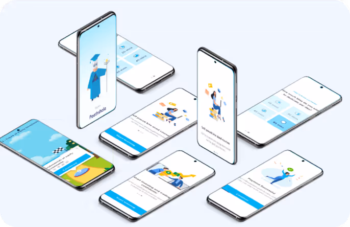
Familiar Visual Language, Clear Differentiation
The interface leverages Paytm’s signature light blue theme, while monochrome variations help visually distinguish between learning modules without overwhelming users.
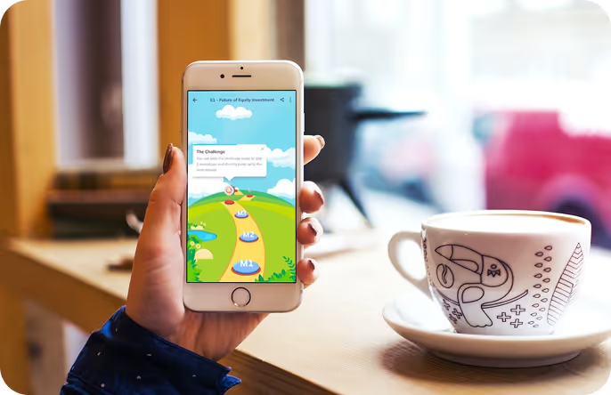
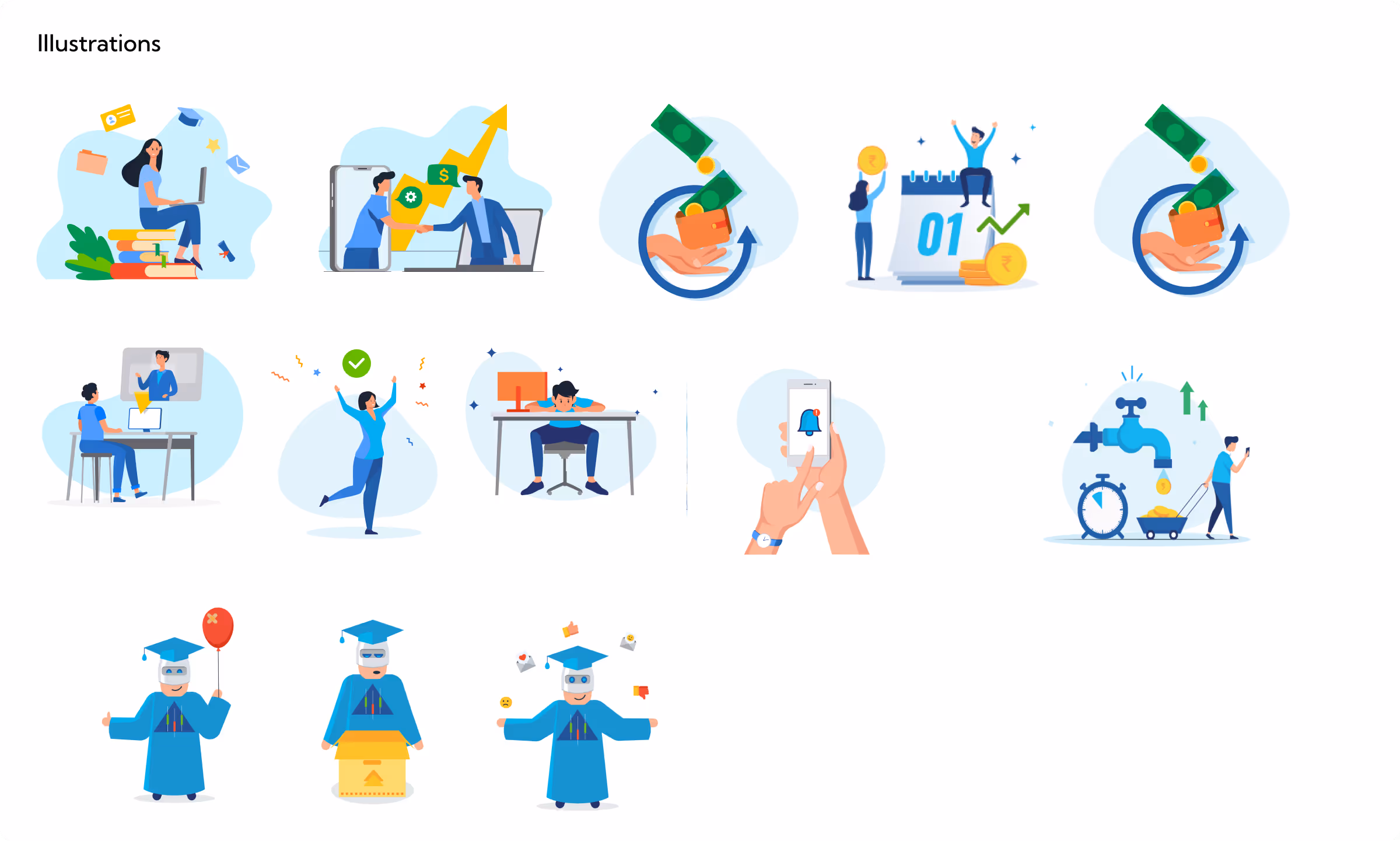
Playful Learning Through Motion
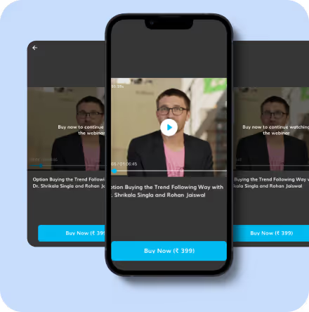
SVG animations were thoughtfully paired with lessons to break monotony, simplify complex concepts, and make learning feel more interactive and enjoyable.
Smarter Interactions, Stronger Engagement
Gamified feedback, progress indicators, and micro-interactions motivate users to continue learning and complete modules and to keep the momentum going.
.avif)
Form Meets Function
Designing Engaging Interfaces
The interface follows Paytm’s established visual language, led by its signature blue palette which relays trust. Clean typography, thoughtful layouts, clear hierarchy, and subtle animations balance usability with engagement, making learning both effective and enjoyable.
Success story
See why we’re not just a UI/UX Design agency; they see us as a strategic partner to their team.

Yellow Slice Team demonstrated exceptional creativity, showcasing innovative solutions and designs for our Chaayos website. Their diverse skill sets were evident in the seamless functionality and user-friendly interface. I appreciate their strong sense of ownership, ensuring the timely completion of tasks with a proactive approach. Their team's readiness to tackle challenges head-on shows their commitment to delivering excellent service.

More Like this
.avif)
Talk to Us Today!
Let’s explore how our creative expertise can transform your product into a human-centric and innovative solution.

Good design starts with Sliced Newsletter
Subscribe to the Sliced newsletter and get the best of research, UX writing, product psychology, CX, and design systems, right in your inbox.
