Designing a Zero - commission trading app
A zero-commission trading and investment platform designed for beginner and experienced investors.
.svg)
industry
Services Provided
PLATFORMS
BUSINESS TYPE
Overview
We partnered with MMT to design a friendly and professional first impression for top talent. The goal was a mobile-responsive interface that feels modern, inclusive, and engaging.


Navigating Complexity
Turning Challenges into Breakthroughs
Simplifying complex trading workflows while ensuring speed, reliability, and clarity for both novice and experienced investors
The Method Behind magic
Our Strategic Design
A structured, user-first design approach guided by research, usability insights, and iterative execution through the STEP framework.


Decoding the Ecosystem
A 360° View
We studied user behaviour, market expectations, and competing fintech platforms to identify usability gaps and opportunities for differentiation.
Customisation via Mobile App
UX Audit revealed a lack of personalisation in orders, which synced smoothly with the POS system.
.avif)
Customisation via Mobile App
UX Audit revealed a lack of personalisation in orders, which synced smoothly with the POS system.
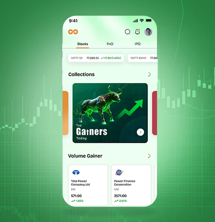
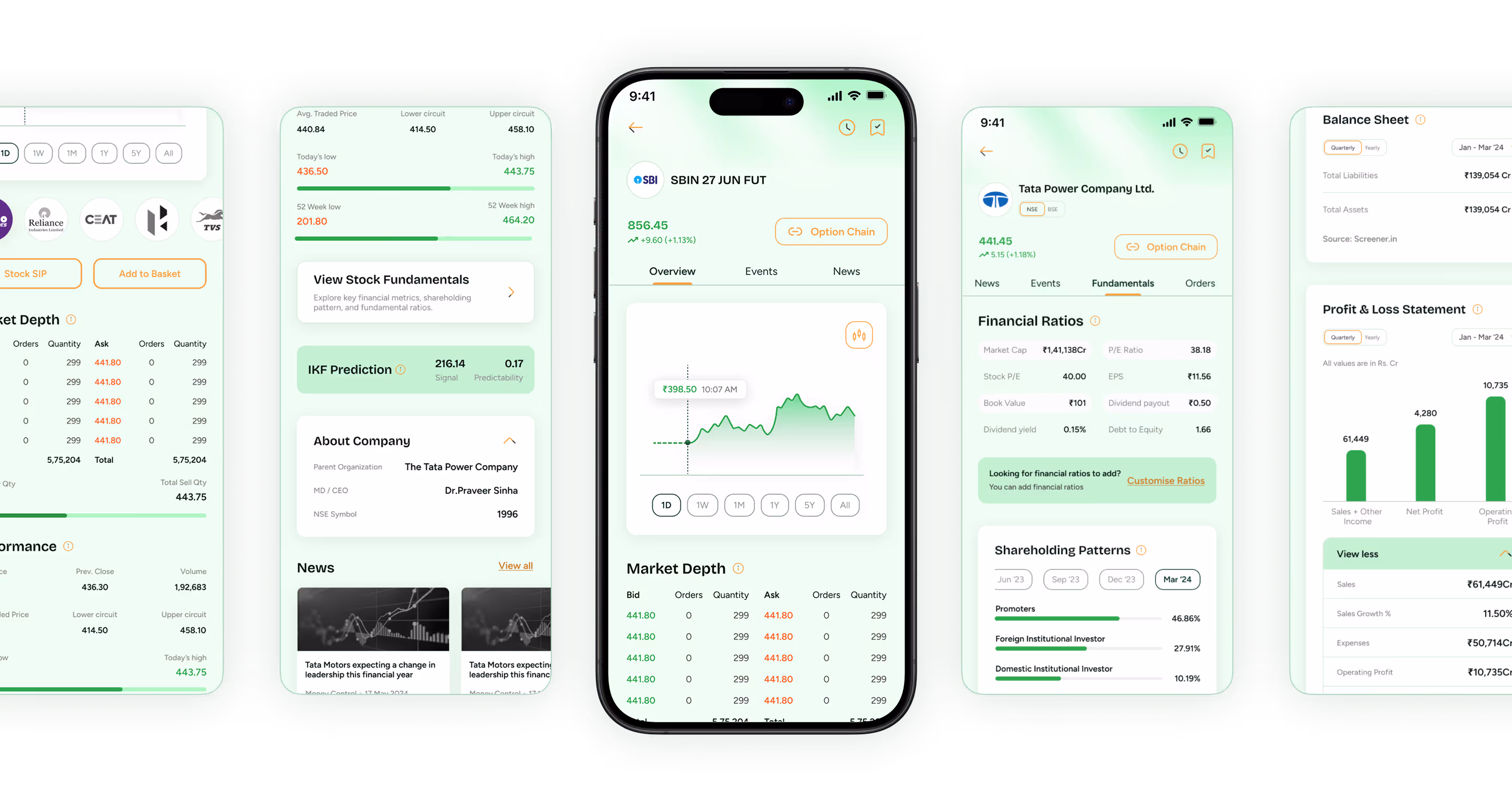
User-Friendly Interface
Ensure a simple, intuitive interface with smooth navigation for both beginners and experienced traders.
.avif)
Portfolio Management
Enhance Shoonya’s portfolio tools to help users track performance, manage assets, and consolidate investments easily.
.avif)
Customisation and Personalisation
Offer personalised settings, custom dashboards, and tailored recommendations to help users customise their experience and optimise their investment journey.
.avif)
upstox

India's first broker to offer free Tick-by-Tick powered NSE Charts for NIFTY F&O trading.
- Upstox offers a news feed of stocks and funds in your portfolio & Watchlist where users can stay updated on what is happening in the stocks they are interested in.
- The in-app switch lets you seamlessly transition between an investor and trader profile. This lets you meet your long-term investing goals and active trading needs within one app.
Groww

Groww claims to be India's No.1 Stock Broker, trusted by more than 10 Million active investors. It offers products for investing, trading, and payments.
- Comparing mutual funds allows users to select funds of their choice and compare them with their annual returns, their holdings, fund details, etc., with a graph showing a visual comparison.
- Groww provides pre-approved loans based on credit score and portfolio, with no paperwork or pre-closure charges.
Understanding Market Alternatives
Analysed fintech platforms and payment apps to identify gaps, features, and opportunities for differentiation.
Core problems
- Complex trading workflows reduce platform adoption for beginners.
- Limited personalisation and portfolio management lower user engagement.
- Technical issues during market surges impact reliability and trust.
Key Opportunities
- Simplify interface and trading flows for faster onboarding.
- Offer customised dashboards and portfolio management tools.
- Build trust with transparent, zero-commission features and educational content.
Architecting Experience
From Insights to Frameworks
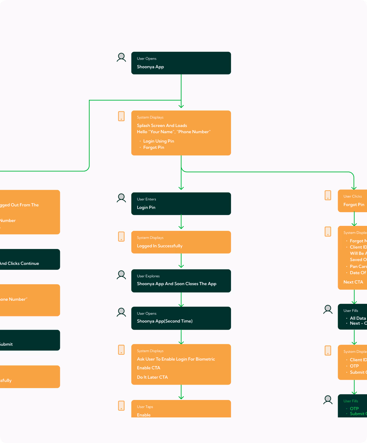
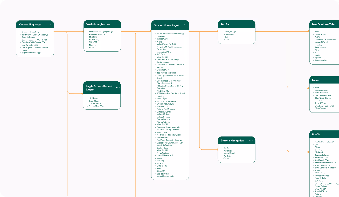
We crafted the user experience for the cafe app, defining prioritised features, intuitive task flows, and clear wireframes. The POS redesign required a new features list, comprehensive task flows, logical navigation, a sitemap, and robust wireframes for seamless interaction.
Our Solution
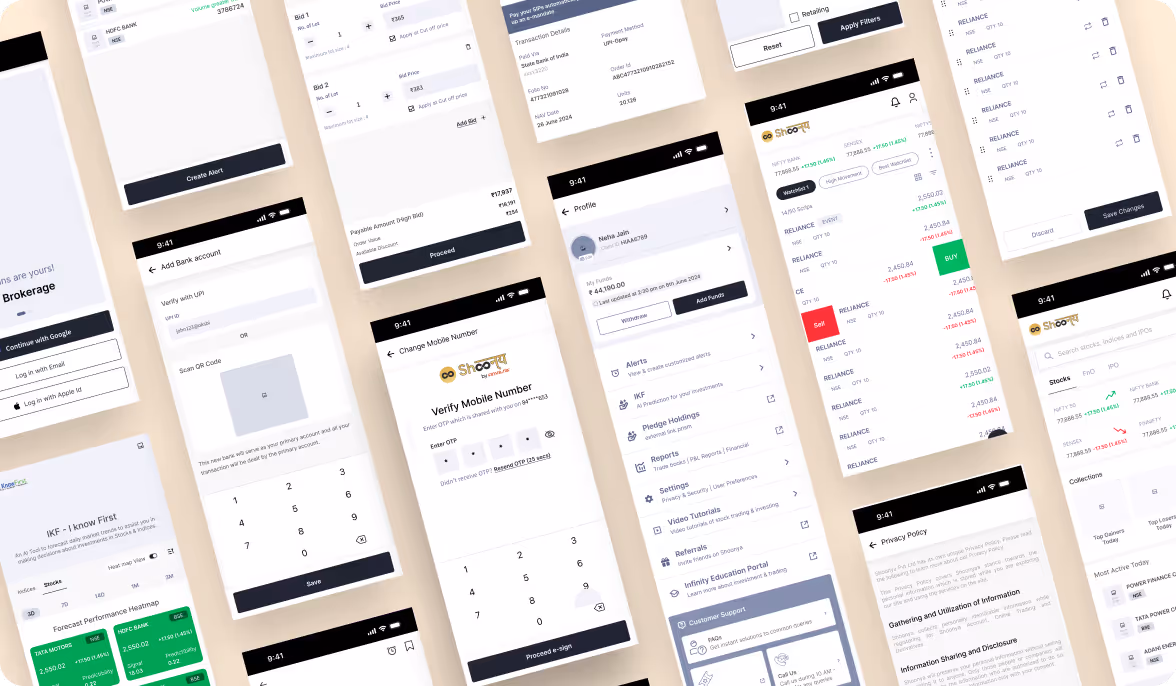
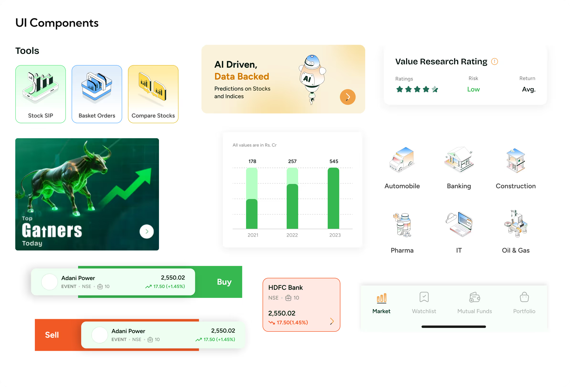
Intuitive Dashboard Design
Customisable dashboards provide clear market insights, portfolio tracking, and simplified navigation for both beginners and experts.
Streamlined Trading Workflows
Optimised order flows reduce errors, save time, and make complex trades easier to execute confidently.
Beginner-Friendly Guidance
UX writing and educational content simplify terminology, supporting informed decisions and building user trust.
Form Meets Function
Designing Engaging Interfaces
UI design combined aesthetics and usability, creating visually appealing interfaces that guide users effortlessly through trading tasks.


Success story
See why we’re not just a UI/UX Design agency; they see us as a strategic partner to their team.

We wanted a design agency with extensive fintech and BFSI product experience. Kishor's knowledge and Yellow Slice's core expertise in fintech design convinced us to move forward with them. The team's designers didn't need constant nudging and knew exactly what to do to create a better UI and UX design. We were especially satisfied with the research phase of the project.

More Like this
.avif)
Talk to Us Today!
Let’s explore how our creative expertise can transform your product into a human-centric and innovative solution.

Good design starts with Sliced Newsletter
Subscribe to the Sliced newsletter and get the best of research, UX writing, product psychology, CX, and design systems, right in your inbox.
