Designing a Dynamic Brand Identity for Venture Catalysts
Venture Catalysts is India’s first multi-stage venture investing platform and one of the most active early-stage seed investors in the country. Since its founding in 2016, it has backed hundreds of startups, built an expansive syndication and investor ecosystem, and helped nurture numerous unicorns and high-growth ventures.
Strategic Brand Positioning & Visual Identity
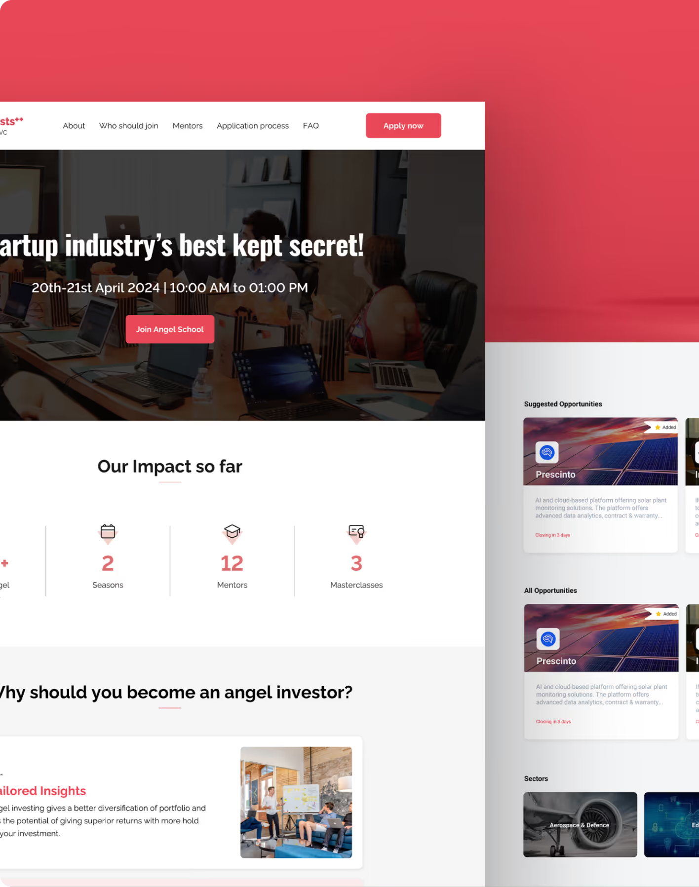


industry

Services Provided

PLATFORMS

BUSINESS TYPE
Overview
Develop a visual and brand identity for Venture Catalysts that communicates growth, dynamism, and trust. Positioning them as a catalyst for startup success and a recognized leader in India’s venture ecosystem.







Elevating a VC Brand Beyond Traditional Financial Visuals
Creating a Distinct Identity With Meaningful Symbolism
Venture Capital brands wanted to become the most recognized early stage investment player of India. The challenge was to craft an identity that reflects Venture Catalysts’ unique role as a growth enabler
The Method Behind Magic
Our Strategic Design
We followed the STEP process (Soak, Think, Execute, Proof) to ensure the platform addressed both educational goals and real student needs.
.avif)
.avif)
.avif)
Decoding the Ecosystem
A 360° View
In venture capital and investment branding, audiences expect clarity, credibility, and a strong narrative. Our research focused on how strategic brand elements, from logo form to colour, typography, and metaphor influence perception of growth.
Establishing Visual Clarity
We reviewed existing visual cues in the Venture Capital and investment category. We identified overused financial motifs and visual noise that dilutes distinct positioning. Based on this, we refined brand elements to ensure that Venture Catalysts communicates momentum and support.
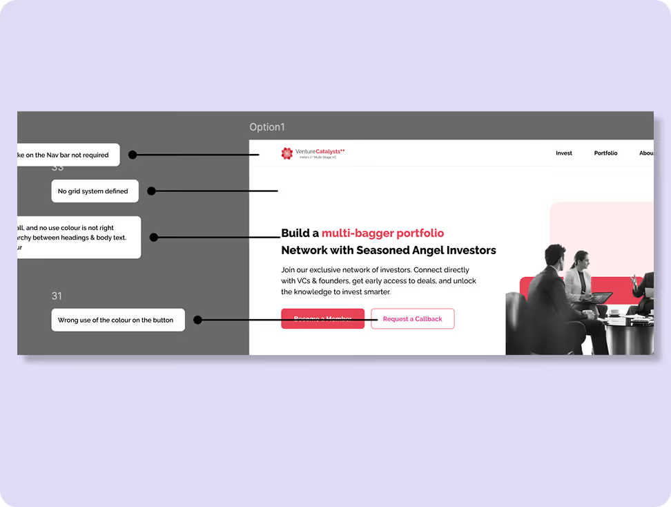
Visual Hierarchy & Symbolic Meaning
Brand graphics were optimized to balance professional restraint with expressive cues. Visual emphasis was placed on the logo’s motion and growth symbolism, ensuring that key visual elements reinforce the brand’s promise of limitless potential.
.avif)
Purposeful Visual Storytelling
Stakeholders responded positively to a narrative-driven identity — one that uses symbolism (like the succulent growth metaphor) to represent care, nourishment, and upward movement rather than generic corporate cues.

Brand Personality & Trust Signals
Participants emphasized the need for a brand voice and design system that feels trustworthy, stable, and inviting — qualities essential for early-stage founders and investors considering long-term partnerships.
.avif)
Indirect Competitors
- Standard financial branding can feel impersonal and detached.
- Audiences engage more with identities that suggest purposeful support and growth.
- Narrative visuals foster deeper recall and brand affinity in investment contexts.
direct Competitors
- Adaptive visual systems with growth metaphors strengthen participation interest.
- Clear visual motion, progression, and symbolic storytelling improve user engagement.
- Identity systems that embody momentum and future potential outperform static brand designs.
Core problems
- Traditional investment branding often lacks emotional resonance and brand narrative.
- Users struggle to connect deeply when the visual identity feels generic or predictable.
Key Opportunities
- Design a brand identity rooted in growth and aspiration that aligns with Venture Catalysts’ mission.
- Use symbolic storytelling and visual systems to build distinct positioning in a crowded market.
- Anchor brand visuals to meaningful metaphors (e.g., the succulent plant representing limitless growth with care) to improve recall and emotional connection.
Architecting Experience
From Insights to Frameworks
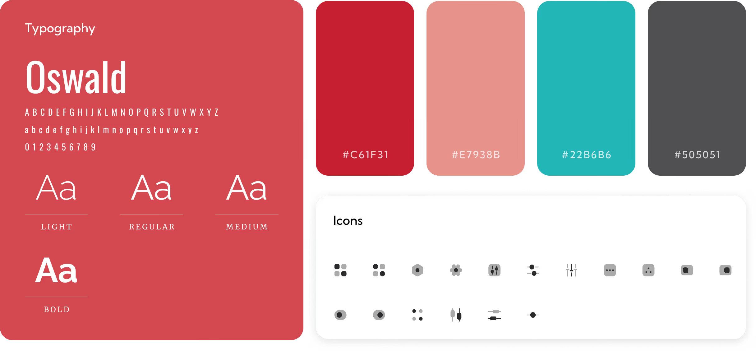
We translated research insights into a cohesive visual framework that guides every touchpoint. From the logo and colour system to typographic voice ensuring the brand communicates trust.
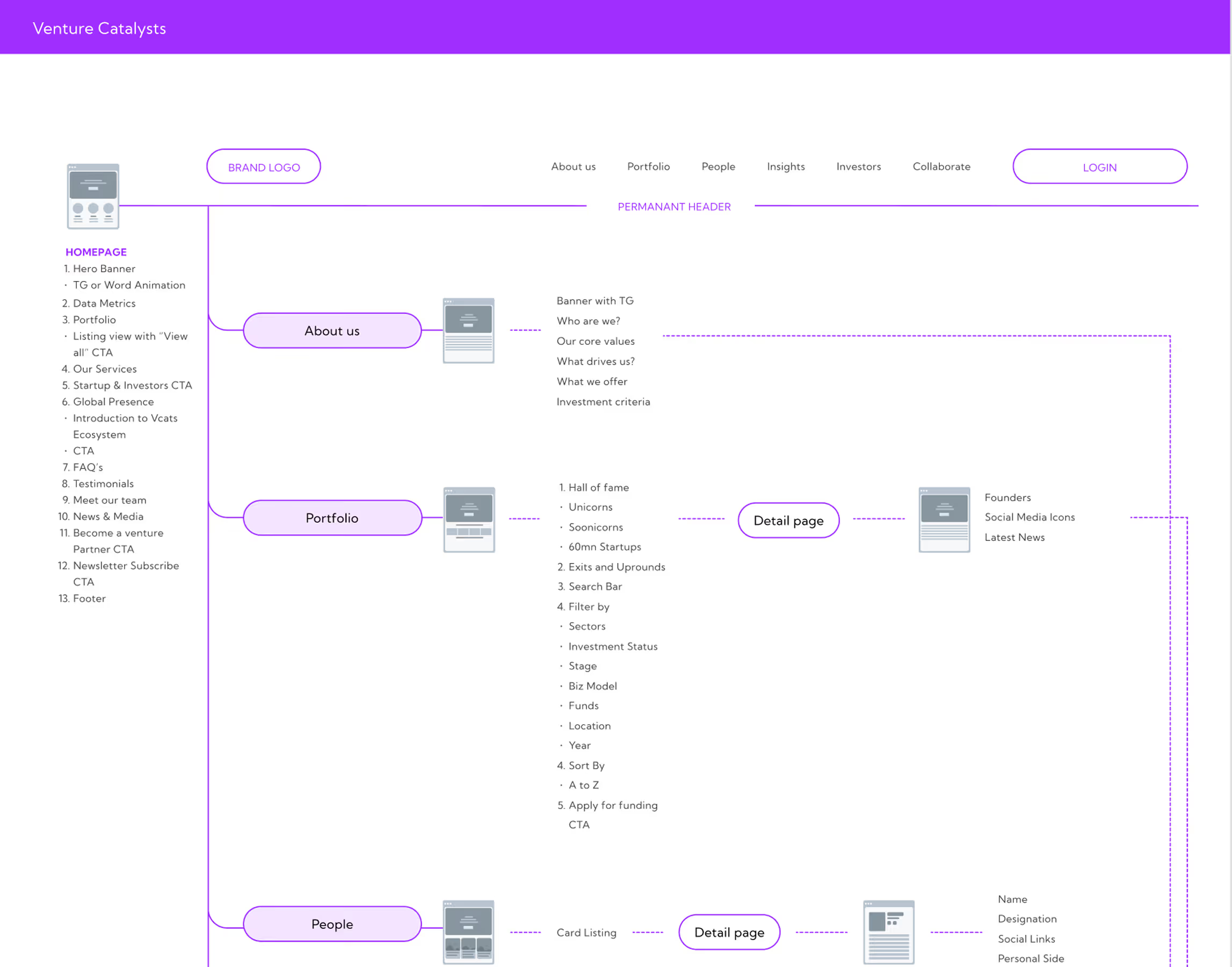
Solution
Narrative-Led Identity
The identity system guides audiences through dynamic visual storytelling that subtly reinforces Venture Catalysts’ role as a catalyst for growth.
Symbolic Visual System
Typography, colour, and form were crafted to express movement and energy. It is rooted in a conceptual metaphor (succulent growth) that embodies the brand’s commitment to nurturing early-stage success.
Cross-Touchpoint Consistency
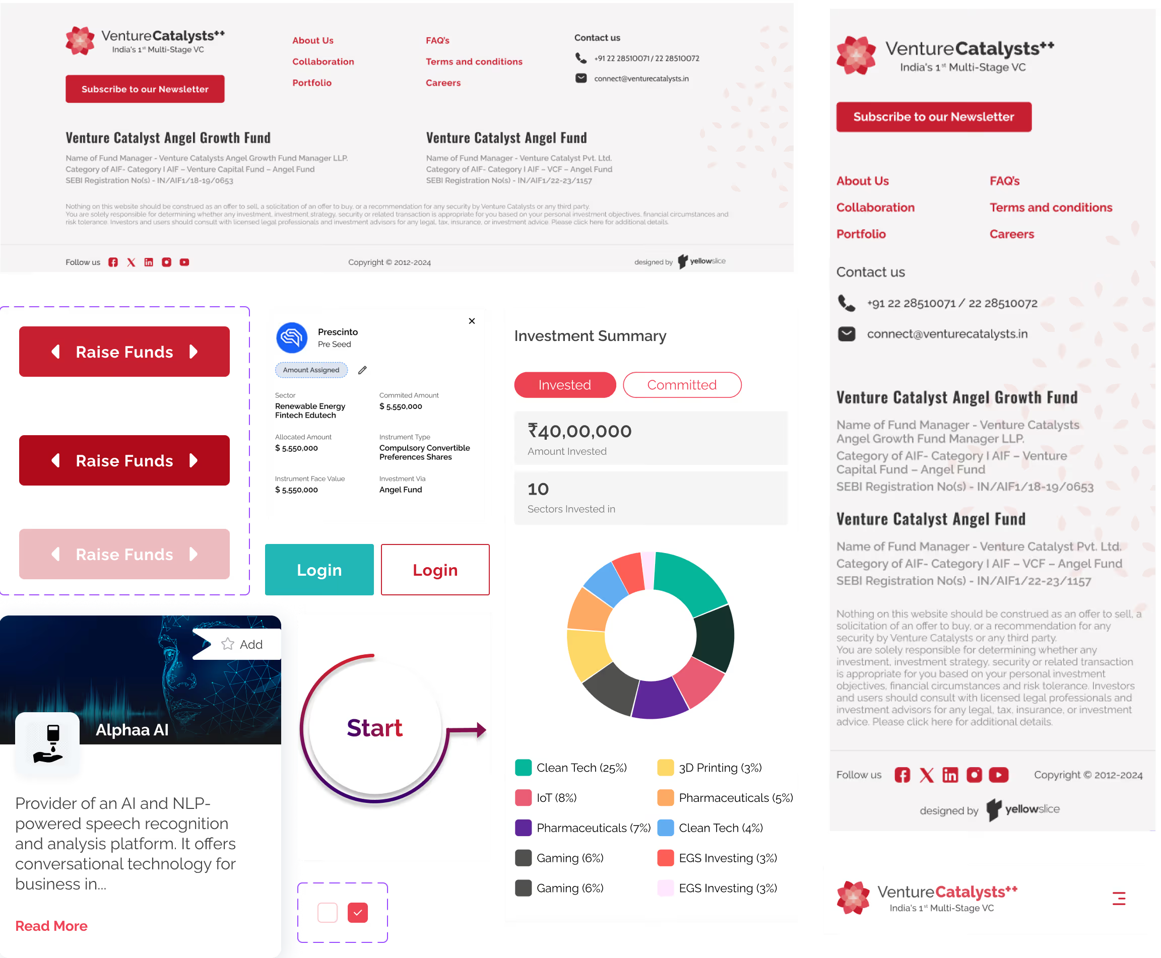
Brand elements were tested and validated across formats from digital interfaces and social, to event branding and print to ensure cohesion.
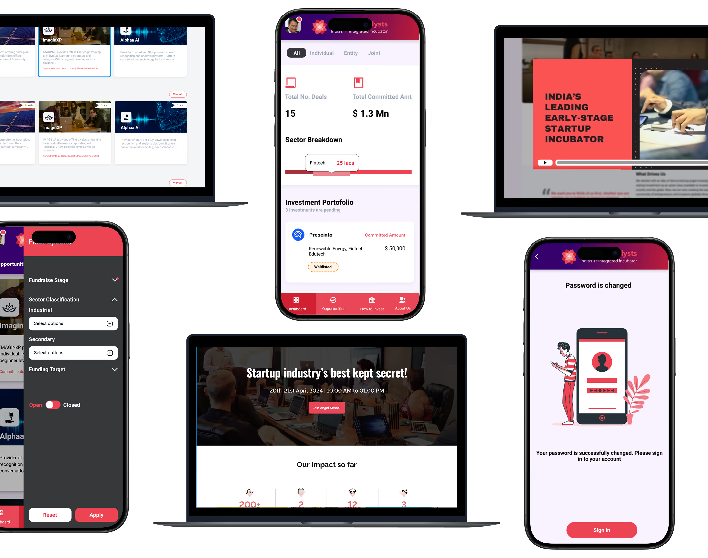
Form Meets Function
Designing Engaging Interfaces
The visual system strikes a balance between strategic meaning and aesthetic clarity. Custom logomark motion, colour palettes, and typography elevate the identity while keeping the brand approachable and credible.
More Like this

.avif)
Talk to Us Today!
Let’s explore how our creative expertise can transform your product into a human-centric and innovative solution.

Good design starts with Sliced Newsletter
Subscribe to the Sliced newsletter and get the best of research, UX writing, product psychology, CX, and design systems, right in your inbox.