Make My Trip App Review by Sagar Bhole

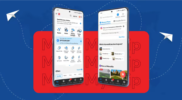
If you type A flight to Thailand or Hotels in Singapore on Google search, you can be sure you will see Make My Trip among the first five search results. It did not just appear on Google SERP overnight. It was a journey that started in 2000 by Deep Kalra, a visionary businessperson.Before it started operations in India in 2005, Make My Trip catered to customers between India and the US with low-cost flight tickets. This increased the demand for travel services in India, and MakeMy Trip took advantage of this and diversified into other travel-related services like hotel booking and holiday packages.Following their launch into the Indian market and a series of growth acquisitions, they were listed on NASDAQ. Five years later, in 2015, they launched their mobile app for both iOS and Android.We will look at the app's success since its inception and its iterations over the years. This will also provide a foundation for suggesting solutions to lingering UX problems. The app has over Five (5) crores of downloads and Seventy-four (74) million active monthly users who have access to direct travel services.
How did Make My Trip become so Popular?
- It was listed on the NASDAQ after ten(10) years of serving customers in the travel industry.
- Their diversification incorporates tourism and travel; they even offer visa application services to their customers.
- They expanded to other countries like UAE, Singapore, Thailand and other Southeast Asian countries.
- Their acquisition and merger of some niche travel brands to enlarge their scope of service.
- The partnership with IRCTC for train tickets brought awareness to the audience base of IRCTC users.
From Data to Decision #UserFeedbackDecoded

- There are missing important filters for search, like companies which limit the search of users.
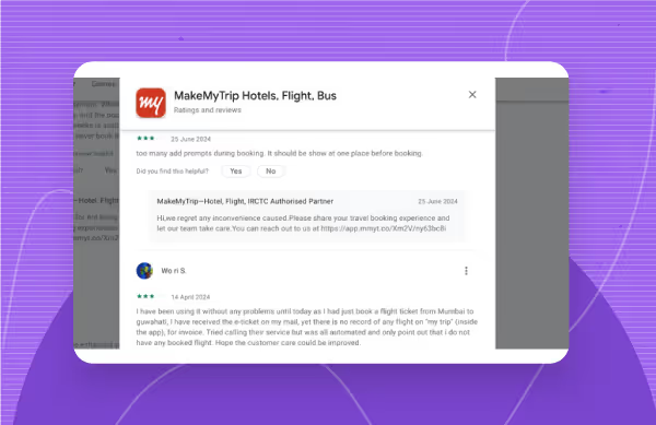
- Technical glitches often occur, which cause users not to receive payment confirmation.
- Users have complained about having too many prompts during booking, which can make them uninterested.
- Some icons are small for the mobile app, making users think they have no use.
- Loading takes a lot of time, and some users think the opening animation might be unnecessary since most people using the app are on the go.
Given these complaints and queries, it only makes sense to review them and see how they help users. As a human-centric design agency, our designers have done their due diligence in translating users' complaints into actionable solutions.We started by understanding users through their reviews on the Google Play Store and iOS App Store. We then examined the app thoroughly to see what users complained about from a design perspective. The review focuses on the overall user and customer experience. It ended with recommendations to make the user journey smoother and help designers, especially in the travel industry.
Make My Trip Ux Review Led By Sagar, A Design Expert At Yellowslice.

Reviewed by:
- Cigdem Atmar
- Srishti Maurya
- Sonalika Vishwakarma
- Harshini
- Shital More
- Aadesh Padave
- Samruddhi Pawar
This is a breakdown of the findings about UX issues.
Inconsistency
Inconsistency is the fastest way for a brand to lose credibility, so why bring it to design? We have noticed inconsistencies that subtly build up mistrust in the user's mind. When an issue escalates, they can quickly point back to the red flags they have seen, such as inconsistency.In the "where2go" section, despite a well-designed layout, card spacing varies inconsistently. The Shadow effect applied to elements throughout the app is not uniform. Some elements have shadows, while others don't, creating a subtle visual confusion.
The UI is cluttered

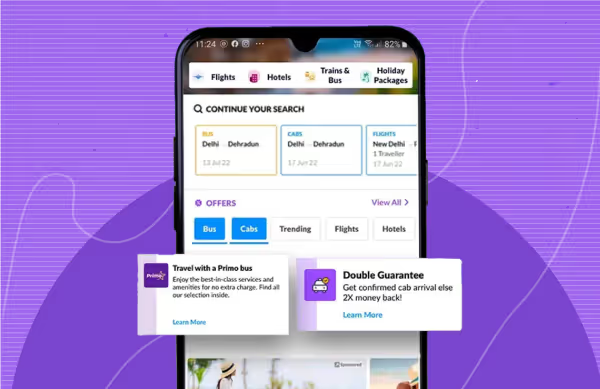
Inconsistency creates a breeding ground for disoriented interfaces. The homepage is the first in-depth impression; it is like the arena for users to know what to do. If it is too overwhelming and visually busy, Users might have a hard time figuring out what they want to do.The hotel and flight listing pages are not adequately spaced, and some elements are inconsistent. All this and more make the interface look too full of visual information.
High-quality Images
As a travel agency, it is best to showcase the product with quality visuals that will easily catch the users' attention and give them an immersive experience with the app. Users have commended the quality of the pictures of their destinations, hotels, etc.However, it also poses the challenge of making the app slow. In fact, the animations could also be a problem if the resolution is not properly optimized for mobile screen sizes.
Customer experience is low.
Travel and Tourism is a hospitality industry, and there should be much emphasis on customer care service. Users repeatedly complain about basic requests, which will make them to lose trust in the brand.Users have complained of having their rides cancelled and having to wait as long as 45 days to get a refund. They have also complained of being referred to bots or prerecorded responses when requesting customer support.
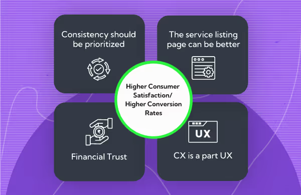
Higher Consumer Satisfaction = Higher Conversion Rates ??

Consumer satisfaction is undoubtedly a good measure of user experience. Our expert designers have critically analyzed these issues and provided solutions to improve the UX.
Consistency should be prioritized.
Consistency is an important principle of design that makes sure elements look alike and behave in similar ways. This aims to reduce the mental effort needed to recognize how the various elements work if they are different.For example, if there are two cards, one with a shadow and one without a shadow, it would create the impression that one is supposed to be clickable while the other is there for description.One way to reduce the chances of inconsistency is to have a design system. It will give a headstart to the UI components such as spacing, interaction patterns, etc. Another thing is a style guide to ensure that the brand element is in accordance with the overall design.As a designer, you can focus on building your library of different UI elements to ensure you have a bank where you can easily reuse elements without needing to manipulate them, which can cause inconsistency in your designs.
The service listing page can be better.
The service listing page allows a brand to showcase its product and should radiate its values and professionalism. As a UX expert, I propose enhancing user experience by focusing on spacing, layout, hierarchy, and alignment.For alignment, a grid-based design will ensure perfect alignment with all the listings, and a responsive design will allow all the elements to snap and fit into different screen sizes.Talking about whitespace, it should be used to create a visual hierarchy and a less congested interface.
Financial Trust
This might not seem like a direct UX Solution, but it gradually affects the user experience. If users can not trust their money with a brand, the app will be seen as a tool for financial inappropriation, which will cause them to abandon it.Users have complained about not receiving confirmations after payment. It also becomes a tussle of war when it comes to getting refunds. It is just like paying an online vendor for a service, and the vendor went mute. The only thing the user will think of is he has been scammed. Aside from consistency in design, there should be automated micro-interaction that alerts users after they complete any task, particularly payment.Various options should also be available for holiday packages, with the services spelt out with appropriate emojis/icons for extra emphasis. Once users see an icon of a hotel or a flight every time they check for a tour package, it becomes registered in their minds. So they can easily associate their money with those services faster than when they are text only.
CX is a part UX
Customer experience and User experience work together. A design is a tool for satisfying a customer's demands, and once a design is implemented, the app's responsiveness also shapes the user's experience.Aside from being a designer or a product professional, you should remember that a brand's website or app does the heavy lifting. Users won't see the numerous discussions across departments; they are concerned with the app/website. If it doesnt work properly, they can as well move to competitors.Your design should focus on helping users solve their problems, providing support and taking feedback from them. The feedback should be implemented to make them feel heard and seen.
Make My Trip User Journey Decoded
1. Is there any voice search functionality in MakeMyTrip?
MakeMyTrip doesn't have voice search integration. This feature could significantly improve usability and accessibility, especially for hands-free planning or users on the go. Accessibility should have a say in the overall design solution.
2. Can I access MakeMyTrip features offline?
While most features require internet connectivity, some can be given offline functionality, like downloading travel itineraries. For example, a traveller might need proof of travel details after a flight. Imagine requiring internet access in a foreign country almost immediately after you get offboard. Stressful, huh? An in-app downloadable feature will help users.
Expert Review by Sagar Bhole
MakeMy Trip is a leading brand in the travel industry and subconsciously sets the pace for other brands; any UX Flaw that gains prominence is likely to be adopted by other brands. This is to understand the gravity of UX design aside users only. The points I provided for review are to reinforce what you know and learn what you do not know.That is exactly what we do at YellowSlice. Our designers are given a platform to exercise their research and design skills to provide the best outcome for the clients and, by extension, the users. This is a cue that we are the best choices for your design project in the travel industry and beyond; contact us to get started.


.avif)
