Designing Icons that Stand Out: Mastering the 7 Principles of Icon Design
Adisha Mandlik
What sets successful icons apart from the rest? Discover the 7 Principles of Icon Design & learn how to create attention-grabbing icons that enhance user experience in this blog.
Icon design is often thought to be simple, given that the technical expertise required to create these designs is comparatively easier than other design elements. However, despite the simple-looking icon, a lot of thinking and detailing goes into the actual design process.
Effective icon design is not just about creating a beautiful-looking icon but also about the size, perspective, simplicity, messaging, and integration with the brand or product design.
Icons are small graphical symbols that represent different actions, features, and functionalities in a digital product. They are the backbone of user interface design, providing visual cues that guide the user through the product.
When done effectively, the icon can make the overall product experience and understanding seamless, which is crucial in today's hyper-digital era. However, creating effective icons is not an easy task. It requires a good understanding of design principles, user psychology, and the technical aspects of icon creation.
In this blog, we will discuss the 7 essential principles of icon design and how to use them to create memorable and effective icons that will enhance the user experience of your digital product.
So, whether youre a designer, developer, or marketer, you will come away with valuable insights, icon design tips and inspiration for creating compelling and engaging icons.
Study by the Nielsen Norman Group found that users spend an average of 0.05 seconds looking at an icon before deciding whether to click on it or not.
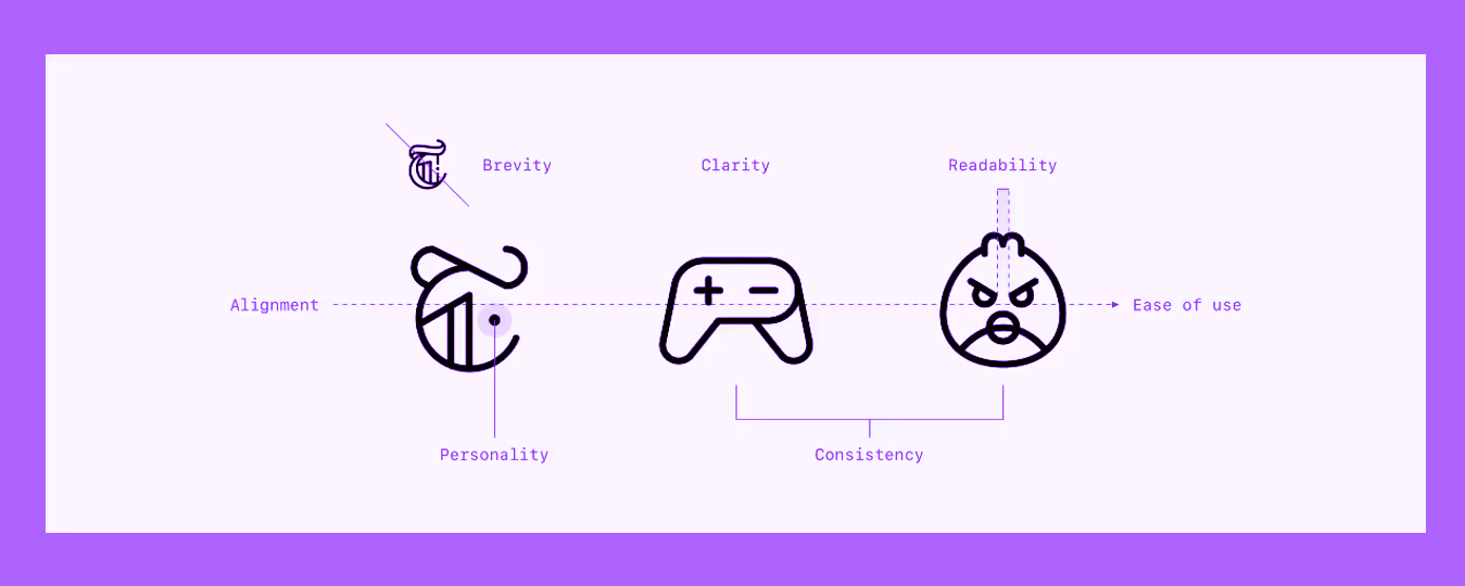
The 7 Principles of Icon Design ??
Icon design principles are guidelines that designers follow to create visually appealing and meaningful icons. These principles include guidelines for the shape, color, size, and style of icons, as well as the overall user experience.
The 7 principles of icon design include:
1. Clarity
When icons rely on strong metaphors, they seem clear and avoid ambiguity. Users dont have to think twice about what action they perform.
The very first golden rule you need to focus on for effective icon design is clarity. Clarity talks about how your user will perceive your icon and what they will deduce after looking at the icon.
Since icons are used to signify visual cues and help users navigate a product, application, or interface effectively, icon design needs to be well thought out from the users perspective.
Example Of Clarity In Icon Design

For example, if you want to create a minimalist icon to signify a startup and are given the above two options, which one will you choose?
If your answer is the first one, you are on the right track to becoming an icon designer. Clarity is ensuring that the icon is obvious to someone who looks at it and communicates the message.
As a designer, you may be tempted to go beyond the obvious, but the ?? symbol is most popularly associated with the startup phase, so it is ideal to be used in this scenario.
Real World Example of Clarity in Icons
What do you think about when you see a trash bin icon? Its for deleting something, right? Regardless of the app, whether its macOS or Android, the trash bin icon is universally understood as one thing, without any confusion.
2. Readability
Icons should maintain readability across different screen resolutions and adapt well in both light and dark modes.
The second design principle for icons is readability. Readability is an important aspect of icon design that refers to the ease with which an icon can be understood and interpreted by the user. A readable icon is simple, clear, and easy to understand without any unnecessary details or complexity.
Icon font, visual weight, geometric shapes, and other basic logo design aspects should be easy to see and comprehendthe basic shapes should be simple and not too busy or cluttered.
This way, the user can easily spot the icon despite having a wide range of elements on the same page, making it easy for them to navigate and find what they are looking for.
Example of Readability Elements In Icon Design
Using basic shapes and clear lines will make the icon more legible and easy to understand. Just as you do with typography, make sure the icon stands out and follows design aspects of the right colors and shades for optimal legibility.
Real World Example of Readability in Icons
Spotifys play green triangle is a simple geometric form, and thats why its legible across all device sizes.
3. Alignment
Consistent alignment ensures the entire interface feels harmonious, with no icon appearing to float awkwardly or sit off-centre.
The third icon design principle, alignment, focuses on how each icon placement is crucial for a solid output.
Icons should be aligned with the rest of the design elements in the user interface. This means that the icon should be placed in a consistent location and should be aligned with other elements, such as text or buttons.
How to create proper alignment in icon design
Proper alignment is an important aspect of icon design that helps create a cohesive and organized layout, making it easier for users to navigate the interface.
An easy way to create a proper alignment in icon design is by using grid-based layouts to ensure consistency. This means using a consistent amount of space between icons and aligning them to a grid to create a sense of order and balance.

Proper alignment helps create a cohesive and organized layout, making it easier for users to navigate the interface.
Real World Example of Readability in Icons
Googles Material Design icon set uses a 2424 grid for all icons, ensuring pixel-perfect alignment across the interface. Whether its search, share, or favourite, every icon feels balanced in relation to others.
4. Brevity
Icons that have brevity succeed because they strip down to only whats essential; nothing distracts from their core meaning.
The fourth icon design principle is brevity, which emphasises the simplicity and reduction of elements in an icon.
Icons should be brief and to the point. This means that the icon should be designed to convey a specific message or concept in the simplest and most direct way possible. A simple and direct design will make the icon more memorable and easier for users to understand.
Examples of Brevity & details in Icon Design

In the above design, we can look at the use of colors and how icon designers need to think when creating an icon. Most icons are to be designed for use on small canvases, meaning that a complicated or heavy design is often not clear to the user and so should be avoided.
Real World Example of Readability in Icons
Instagrams heart icon conveys the intended emotion without any unnecessary embellishment or effort.
5. Consistency
When icons share a consistent rhythm and style, users instinctively know they belong to the same brand ecosystem.
The fifth icon design principle is consistency, which refers not to the repetition of an icon design but to the consistency of design in the icon families. While each individual icon is unique and should convey its own message, the icon together should coexist in harmony.
For consistency in icon design, you need to ensure that the icons carry the same size, shape, color patterns, shadows, alignments, and overall design principles.
This can include creating new icons set with rounded corners, such as a rounded rectangle, or double-checking for stroke weight, pixel grid, icon set, and other ways that designers use to make icons consistent.
Examples of Consistency in Icon Design
The example below showcases how you can design unique icons with different color options but have the same pattern to make sure that it syncs with the other icons.
The example has icons with a similar shadow pattern and size, which blends perfectly despite having unique colors and icon types.
Real World Example of Readability in Icons
Microsoft uses a consistent design rule for its icons across various apps, including Teams, Outlook, and Word. They are known for their uniformity in weights, rounded corners, and cohesive geometry.
6. Personality
Icons with personality make interfaces memorable and emotionally engaging; users start associating those icons directly with the brands voice.
The sixth principle talks about the personality or the unique branding of the icons. Icons with personalities can make a digital product stand out and make it more memorable to users.
This can be achieved by incorporating unique elements, such as a specific style or theme, into the icon design. Personality is what distinguishes common icon sets from premium icons.
Incorporating personality into icon design can greatly enhance the user experience and make a digital product more enjoyable and memorable for users. By paying attention to these elements, designers can create icons that are not only visually pleasing but also functional and easy to use.
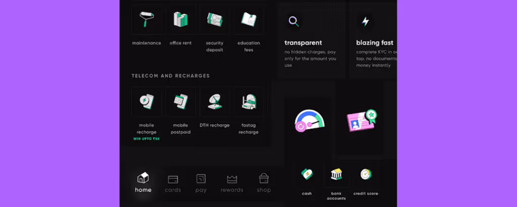
Example of Clever Branding or Personality In Icon Design
An example of icons with personality and brand guidelines being used optimally can be found in the CRED app.
For someone familiar with the app, these icons, despite being used separately, reflect the branding and personality of the CRED app, which features a playful and colorful design that reflects the fun and enjoyable elements that the brand tries to focus on.
Real World Example of Personality in Icons
Duolingos personality is that of a playful and exciting teaching app; hence, they use icons such as the owl motif and expressive micro-icons that create a cheerful learning experience.
7. Ease of Use
The simplicity and familiarity of these icons make interaction frictionless; users dont need to stop and think, they just act.
The final design principle talks about simplicity and ease of use. When it comes to icon design, the golden rule is - less is more. The lesser elements and simplicity in the icon sets, the easier it is to use them in a product or application.
Icons that are easy to use can greatly improve the user experience. This means that the icon should be designed to be intuitive and self-explanatory.
Example of Ease Of Use In Icon Design

A good example of this is the icons for a music streaming app, which are minimalist yet convey the message without needing any text to go along with it.
Each icon features a simple and recognizable design that clearly shows the user where they are and how to get to their destination.
Real World Example of Ease of Use in Icons
Ubers navigation icons, such as the car and location pin, are examples of intuitive and easy-to-use icons. They are designed to be instantly recognisable even when users quickly glance.
8. Point Icon Design Checklist
Before you finalise your next icon set, run through this quick checklist to ensure your designs meet all the right marks.
- Clarity:
Does the icon clearly communicate its meaning at a glance?
- Readability:
Is your icon legible at all sizes and on different backgrounds?
- Alignment:
Are all your icons properly aligned on a grid?
- Brevity:
Have you simplified the icon to its most essential form?
- Consistency:
Does the icon set feel cohesive?
- Personality:
Do your icons reflect the brands tone or character?
- Ease of Use:
Are your icons intuitive and easy to understand without labels?
The Bottom Line
Now that you know the golden rules of icon design, you will be able to design professional icons for brands that can stand out while blending in perfectly with the overall approach of the brand or its product design.
Before you start designing an icon, the crucial part is understanding the purpose of the icon and its placement. This will help you think from the perspective of the user and create aesthetically pleasing icons that are also user-friendly. Partnering with the best UI UX company in India can ensure that your icons are both visually appealing and functional.
Also, remember that these 7 icon design principles are merely general guidelines to help you master the art. The final output always depends on how well you can understand the requirement and execute these technical rules to perfection. It takes practice and a human eye for detail that can distinguish a high-quality designer from other designers. So if you need help creating professional icons, consider a custom icon design service to help you get started and get the desired output that you need.
Design is not just what it looks like and feels like. Design is how it works.
Steve Jobs
FAQs about Icon Designing
Can the principles be applied to any type of icon?
Yes, the principles can be applied to any type of icon, whether it's for a website, app, software program, or any other digital platform.
How do I ensure consistency in my icon design?
Consistency can be achieved by using a similar style and design across all icons in a set, making sure they look and feel like they belong together.
What are the properties of an icon?
The icon properties determine how files of a particular type are displayed by DeskSet applications (such as File Manager), and what happens when files of that type are opened or printed.


Let's create something amazing!
Let's discuss your vision and how we can bring it to life with impactful design solutions.
.avif)
Good design starts with Sliced Newsletter
Subscribe to the Sliced newsletter and get the best of research, UX writing, product psychology, CX, and design systems, right in your inbox.
