The Law of Prgnanz and UX Design
Anthony Fernandes
Like every other field, UX Design has rules and principles guiding how we practice the knowledge. One of the laws of UX is the law of Pragnanz, which is based on Gestalt psychology. This principle has not gained momentum among UX Designers, unlike regular principles like hierarchy, Balance, Contrast, etc. These principles and laws are in place to bring us back to the basics of UX Design, which is design-solving problems, human(User) Problems, to be precise.The principles, theories, and laws of UX design are interconnected and interdependent, so when you see other principles in this article, they reinforce your knowledge and help you understand the law of prgnanz.
What exactly is the law of Prgnanz?
The first thing to note is the uniqueness of one of the spellings of the word Prgnanz, which should spark curiosity. A quick Google search revealed that it is a German word that means Pithiness, which could mean simplicity, conciseness, or orderliness, depending on the context in which it is used.Further research showed that it was first used in the early 1900s, probably in the 1920s or 1930s.
- Prgnanz is a by-product of Gestalt psychology,
- Gestalt psychology simply means Human perception.
- Prgnanz is the psychology of good figures or easy perception for better understanding.
- It is simply the psychology that explains why humans find an easy route to a situation to understand the problem.
Max Wertheimer, Kurt Koffka, and Wolfgang Khler propounded this theory. Gestalt Psychology and Pragnanz can be used interchangeably.Bringing the definition to design language, the law of pragnanz explains how our visual perception mechanism works. It explains that the human mind will try to declutter visual information easily and give it meaning. It positions the attempt to organize and arrange visual content as a positive or good figure.As civilization grew, designers wanted to better understand psychology to solve problems, so the law of prgnanz brought a new perspective on understanding humans. One theory is that we do not consume information in parts but as a whole. It explains why a background colour can ruin a design even when other design elements are on point
The law of Prgnanz in our day-to-day activities
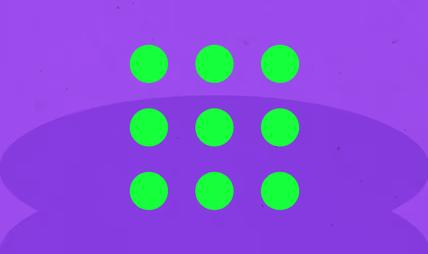
One philosophy we should hold on to as designers is that Life is a design. So it is best for us to understand how principles of design, especially the law of prgnanz, can help us navigate life before we help others solve their problems.For example, Students prefer reading their notes from a slide because it looks more compact and has more bullet points than bulky PDFs, where they can get detailed information about a topic or subject.Another vivid example is trying to spot your friend in a crowded room. Do you start by meeting each person one by one? No. Automatically, the next thing to do is have a quick scan from where you are to check for something peculiar to your friend. It could be their hair or clothes. Your brain is then wired to pick out that feature and find your friend from the room rather than going to meet each individual.The cloud is formless, so it doesn't have any meaning, but trying to connect the dots and give it meaning, like a shape, animal, or anything, the law of Prgnanz here tries to associate those figures with something we already know to make meaning out of them
The link between the law of Prgnanz and UX Design
Since we always look for an easy way out, our minds naturally perceive visual information in the simplest and most coherent way possible. As problem solvers, we should focus on the easiest solutions for users. Complexity creates mental clutter, while clear organization brings order and understanding. Users can focus on the task when they don't have to decipher a visual puzzle.
The law of Prgnanz and users
This is how users recognize and respond to the law of prgnanz; it will help you understand how to approach your design.
- Pattern Recognition: Humans instinctively search for patterns and familiar shapes. In UX design, users can quickly recognize similar colours, shapes, text sizes, etc., to grasp and familiarize themselves with an interface's layout and functionality.
- Completion Tendency: Our brains have the unconscious urge to fill in gaps and complete information. This is why we can "see" a circle, even if it's just a part that is drawn on a page. Similarly, users expect an app or a website to be simple enough so that they can quickly find meaning in any missing information based on existing elements.
- Cognitive Load: Prgnanz helps users process information quickly, and if the users cannot process your design fast enough, they will most likely drop it and move on to the next easy option.
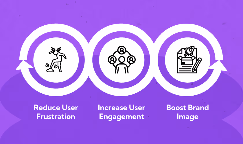
Why Prgnanz Matters to Designers
- Reduce User Frustration: Users consume information as a whole and not in parts, so a design with complex interfaces will lead to confusion and frustration. As a designer, if you understand this, you'll make an effort to ensure your design comes together, whether as a whole or in sections.
- Increase User Engagement: An engaging interface keeps users interested and actively interacting with the product. The law of prgnanz will help you identify means of bringing Clarity to a design and ease of use to build a positive user experience that encourages more exploration.
- Boost Brand Image: A well-designed interface reflects positively on a brand, conveying a sense of professionalism and user-centricity. This builds trust and loyalty in the long run.
How to use the Law of Praganaz as a UX Designer
Now that we have a clear understanding of the law, the next thing is to understand how we can use the law to make functional designs.
- Visual Hierarchy: Visual Hierarchy is the arrangement of elements in a design, usually from the most important to the least important. Think of it as spotlighting an important features in an app or website. Prgnanz helps designers to emphasize information by using size, colour, and placement.
Once the most important elements stand out, users do not need to unconsciously try to connect the dots before carrying out a task. Have you seen a website where the "Buy Now" button is the largest and brightest element? That's the law of Prgnanz in action!
- Simplicity: This law should back up our understanding of striving for simplicity, whether in UX Copies, UI designs, or User surveys. Prgnanz's law should remind us to remove unnecessary elements, leaving what's essential for the user to perform the task at hand.
For example, the homepage of a mobile banking app should showcase only account balance and most recent transactions, not bombarding users with stock quotes they don't need or irrelevant marketing materials.
- Grouping for Clarity: Designers should focus on consistency and grouping related elements together to create a sense of visual organization. This makes it easier for users to take a quick look at the interface and decipher the relationships between different components. For instance, the way Spotify grouped the library into "Playlists," "Artists," "Albums", and Podcats & Shows explains that they have different functions for a more personalized listening experience.
- Whitespace is Your Friend: In oral communication, Silence speaks the loudest. The same applies to design. Negative/White space passes a message to users: clarity, thinking, and breathing space.
Prgnanz reminds us that whitespace allows visual elements to breathe. Whitespace separates sections and improves readability.
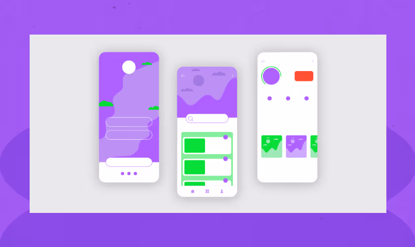
- Try Wireframing: A wireframe is a rough sketch of how your design is going to look like. It should act as a guideboard before designing; it will help you identify the degree of ease or difficulty in usability so that you can adjust accordingly before spending time on the actual design.
Key takeaways to keep in mind
- Focus on clarity and ease of use over aesthetics. It is a UX Design, not an IG Page.
- Design for your target audience, considering their needs and expectations.
- Lay emphasis only on the most important information and actions.
- Ask yourself if your six-year-old sibling can use the design with little to no aid.
As Designers, one thing to always remember is the law of Prgnanz. We often find ourselves in a situation where we have a great flow of creative ideas, and it happens that we tend to complicate their designs with far too many complex visual elements that the human brain finds difficult to process quickly. This, in turn, confuses the user about what they need to do and where they need to focus. So, as designers, this law is a constant reminder that while we get creative and think out of the box, we should not lose sight of the goal we initially set to achieve Usability!Words on Marble from the head of UX Design, Yellow Slice - Anthony Fernandes

Case studies of how popular brands used the law of Prgnanz
Instagram: A social media app that allows users to share photos and videos easily.Prgnanz Solution:
- Focus on the Image: Instagrams for-you page contains user-generated content. The interface prioritizes clean layouts that showcase photos and videos prominently. This will tell the audience that the main thing to do is share videos and pictures.
- Minimal Editing Tools: The editing tools are readily accessible to even a novice in content creation. Users don't have to wonder what the scissor emoji means in the reel editing interface.
- Intuitive Navigation: Instagram uses simple icons and gestures to guide users through the app. This makes sharing, liking, and commenting on content easy, which is the app's basic task. Frequent interaction with the app will help users grasp the functionalities of other tasks.
Spotify: Spotify offers a personalized music experience that helps users discover new music while navigating a broad collection of audio information/ libraries.Prgnanz Solution:
- Personalized Recommendations: The homepage showcases curated playlists and recommendations based on user preferences and listening habits.
- Intuitive Search and Navigation: The Search function on the mobile app and website is very obvious, and browsing menus are categorized clearly by genre, artist, and mood to help users narrow their search.
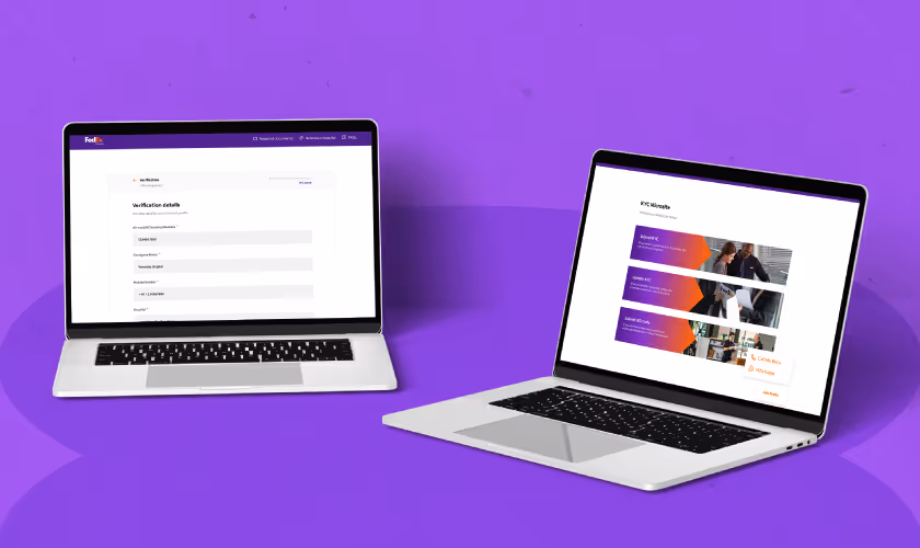
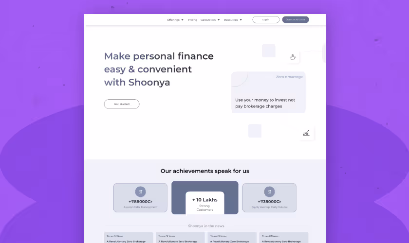
FedEx KYC Website: Its KYC microsite is a secure platform where users and companies can complete the e-KYC process.Prgnanz Solution:
- Simple UX Copy: The website uses simple terms and language to help users understand technical legal and security terms.
- KYC is made easy: Users can view the necessary information on one page rather than dividing it into many pages, which might cause them to lose interest.
Grouping FAQs section: The FAQ page was simplified by grouping questions on similar topics and tagging them for fast recognition.
Conclusion
Learning about the law of Prgnanz does not end here; read more articles and whitepapers to familiarize yourself with the extra details on human psychology. More importantly, it needs constant practice.If you are looking to utilize the new knowledge to create and improve your product, YellowSlice is ready to have you onboard and discuss how we can take the next step. We are a design agency that offers design solutions through UX Research UX Audit, UI//UX Design and much more. Send a message to us now.
FAQs Law of Prgnanz and UX Design
1. Does Gestalt psychology have other principles?
The law of prgnanz is not the only principle associated with Gestalt psychology; it is the most well-known and outstanding principle often underestimated in many designs. Other principles include Proximity, Contrast, Symmetry, Continuity, etc. These principles provide a better explanation of how users perceive visual information and how designers can use this information to create usable designs.
2. How does Prgnanz differ from minimalism in design?
Minimalism doesn't necessarily mean usability. The design trend focuses on creating an aesthetically pleasing interface with limited colours, reduced vibrancy and clean looks. Prgnanz, on the other hand, gives more information about the psychology of how humans easily perceive visual information. Minimalism is the by-product of understanding prgnanz. However, if a minimalist design does not follow other core UX and gestalt principles like hierarchy, then it is as good as useless.
3. How can we measure the effectiveness of Prgnanz in UX design?
- User Testing: We can observe how users interact with the interface to identify areas of confusion or difficulty. Through the backend, you can monitor the time spent on tasks and completion rates, coupled with user feedback, to provide information on how well you applied the law of prgnanz.
- Eye-Tracking: Tracking where users look at the interface can reveal areas that attract attention or, get overlooked with eye-tracking tools. This information can help designers optimize the visual hierarchy and ensure key elements are seen.
- Conversion Rates: In e-commerce or other goal-oriented interfaces, measuring if users complete desired actions (purchase, sign-up) can indicate how effectively the interface guides user behaviour.


Let's create something amazing!
Let's discuss your vision and how we can bring it to life with impactful design solutions.
.avif)
Good design starts with Sliced Newsletter
Subscribe to the Sliced newsletter and get the best of research, UX writing, product psychology, CX, and design systems, right in your inbox.
