Designing the Future of Learning
An e-learning platform for classes 8–12 with gamification and personalised analytics to help students master their weak areas and excel in exams.
industry
Services Provided
PLATFORMS
BUSINESS TYPE
Overview
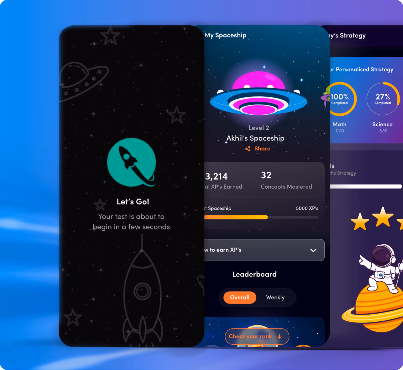
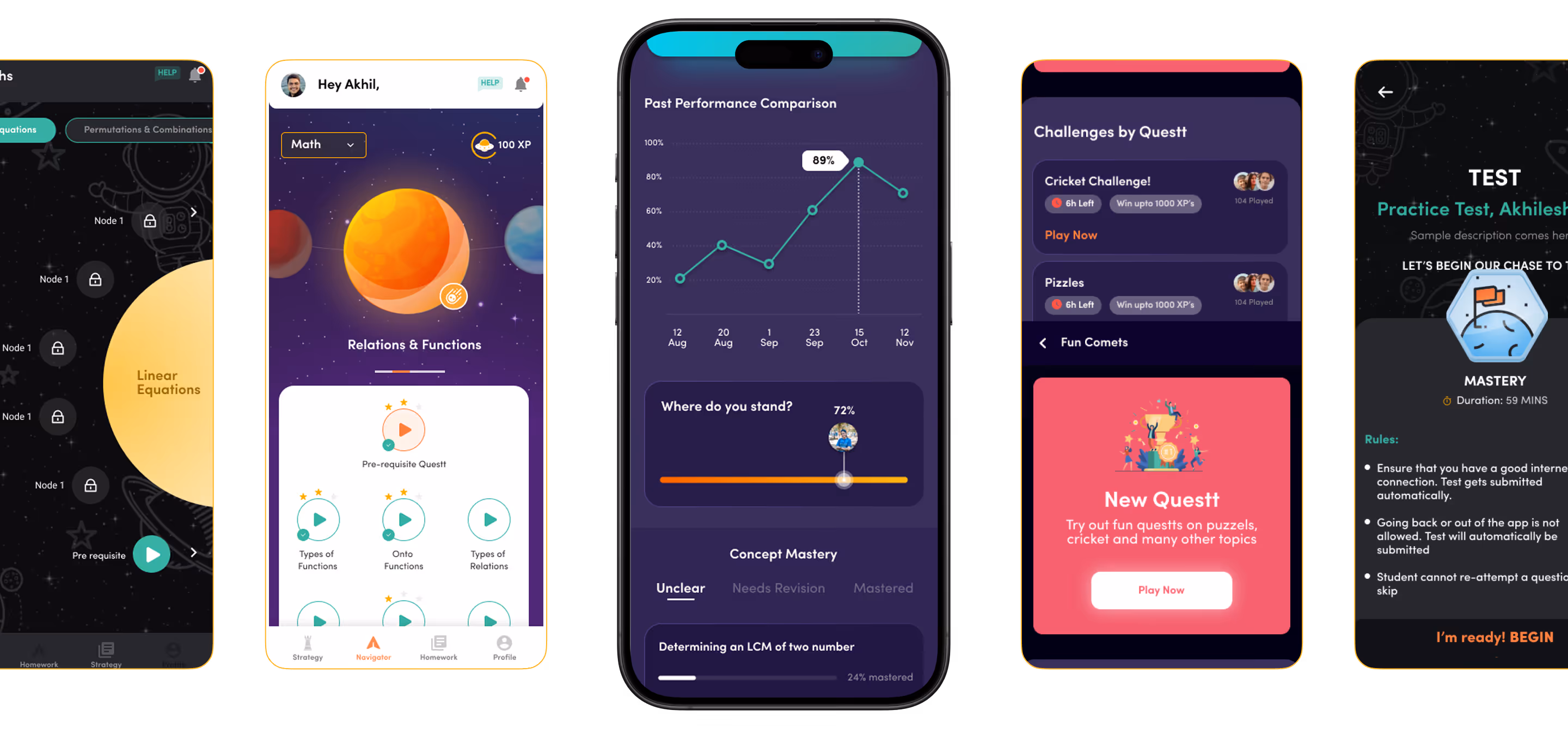
Questt is an adaptive learning platform that tailors study experiences for students. Our goal was to design an interface that simplifies concept-based learning while adding the excitement of gamification.


Navigating complexity
Turning Challenges Into Breakthroughs
Students struggle with short attention spans and a lack of motivation to study. Traditional learning apps often fail to keep them engaged or help them retain concepts effectively. So, how do we design an application that students genuinely enjoy returning to? The one that makes learning feel intuitive, interactive, and rewarding.
The Method Behind Magic
Our Strategic Design
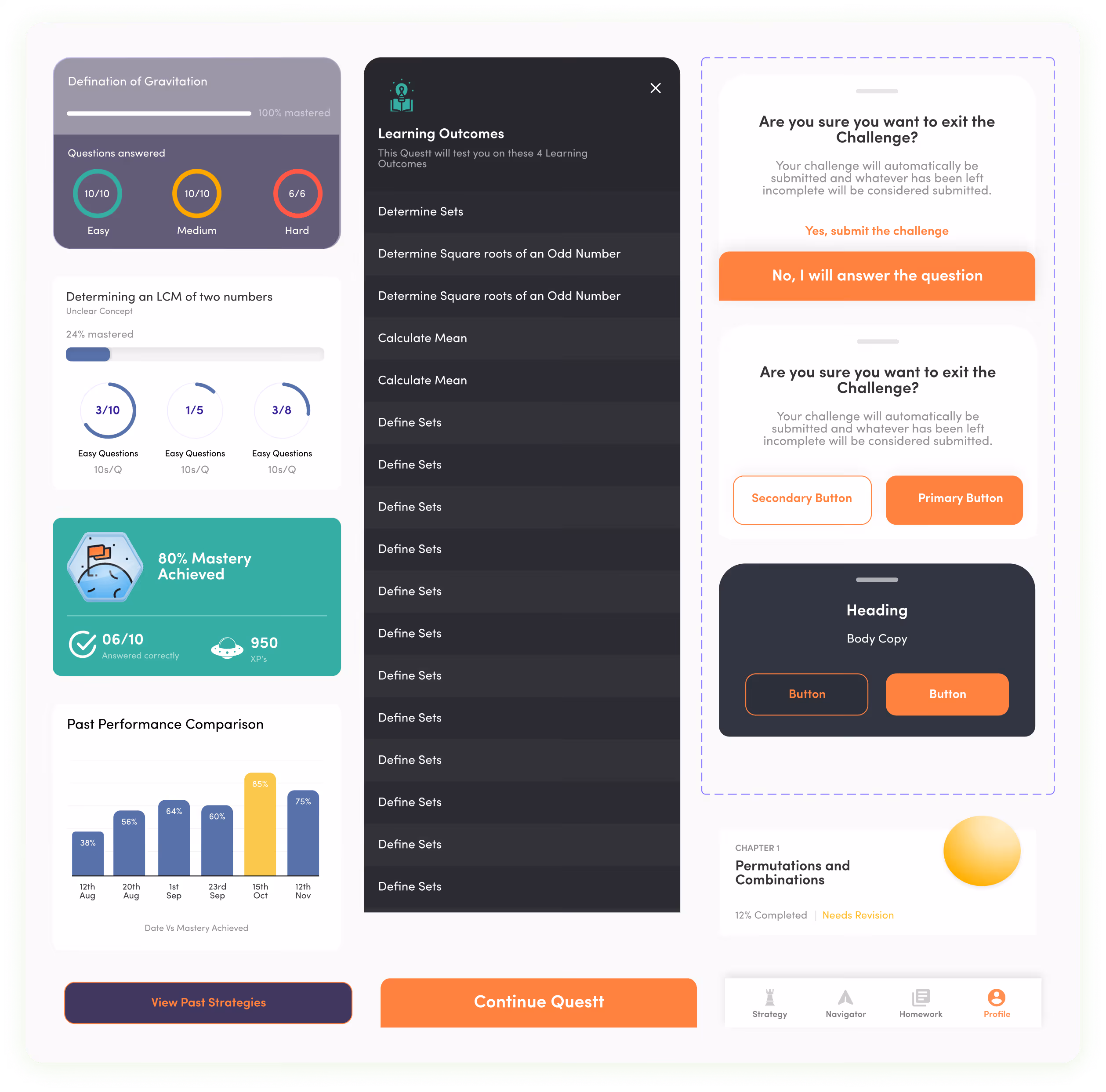
Using the STEP process, we grounded Questt’s design in real student behaviour to make learning feel intuitive and rewarding. Progress cues, personalised feedback, and gamified interactions encouraged users to engage with targeted practice and track growth. We combined playful visuals, interactive elements, and consistent UI components to create a seamless, student-friendly interface.

.avif)
.avif)
Decoding the Ecosystem
A 360° View
Though a thorough competitive analysis was not conducted, just the UI of a few competitors was analysed to understand how the application should function.
Understanding Student Learning Journeys
The UX audit revealed that students were getting overwhelmed by dense content, unclear learning paths, and too many options presented at once. To address this, we conducted a 5-day sprint workshop to map student journeys, identify friction points, and understand how learners move between concepts, practice, and revision.

Streamlined Learning Paths
Navigation was structured so students could easily find daily practice, targeted revision, performance insights, and personalised recommendations with minimal effort.
.avif)
Core problems
- Learning journeys were unclear, with messy information hierarchy and unpredictable user flows.
- Lack of motivation cues made it harder for students to stay consistent with daily practice.
- Task completion felt flat and transactional, offering little emotional feedback or sense of progress.
Key Opportunities
- Simplify information hierarchy and lesson structures so that learning journeys are clear and user flows are predictable.
- For gamified learning we integrated badges and streaks to motivate consistent progress.
- For interactive feedback we added animations that celebrate task completion and improve emotional connection.
Architecting Experience
From Insights to Frameworks
We followed four significant phases to ensure that all aspects of the platform's UI design and our main focus was UI design.

Solution
Redesigned UX
Moodboards were created with the perfect visuals for the designs by referencing various inspirations on the mobile application. As per the project requirements, a style and theme were finalised to work with and improvise accordingly as needed.
Well Thought UI
The UI design brought our ideas to life. Our designers selected UI elements like colours, typography, and a design system aligned with the research and UX recommendations. Another thing we kept in mind was compliance with the brand identity.
Catering to All Users
To increase retention and conversion rate for both paid and non paid users we made the platform engaging and personalised. Gamified experience helped users to build their learning strategy.
Form Meets Function
Designing Engaging Interfaces
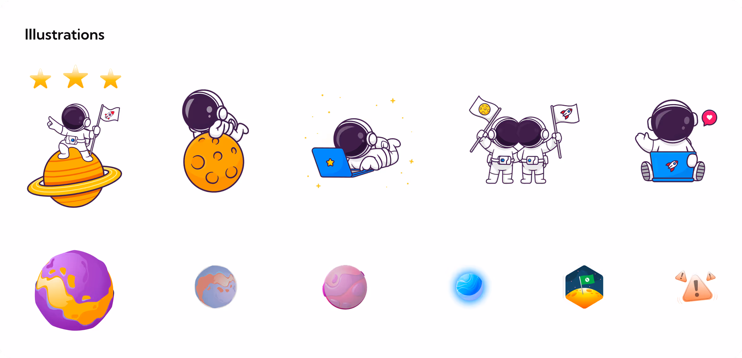
We created 100+ UI screens with a unified, student-friendly aesthetic. For typography we used the font Sofia Pro. For primary colours we used Orange, black and different shades of dark grey. For secondary colours we used teal green. For text colours we stuck to black and white.

More Like this
.avif)
Talk to Us Today!
Let’s explore how our creative expertise can transform your product into a human-centric and innovative solution.
Good design starts with Sliced Newsletter
Subscribe to the Sliced newsletter and get the best of research, UX writing, product psychology, CX, and design systems, right in your inbox.
